More style than substance
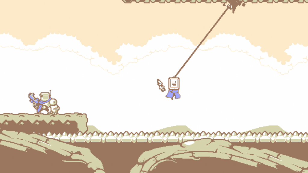
You can probably tell from a single glance that Kunai is a very elegant game. In many ways, it puts style over substance, although that’s not always a bad thing.
For example, it would be pretty accurate to say that the most memorable feature of this game is the character design. It’s easy to get distracted simply by watching Tabby’s different expressions as she launches into her latest challenge.
Beyond that style, there’s no super deep or super long game waiting for you. But creating a character whose style and design can rightfully stand alongside Samus Aran and Simon Belmont is an achievement in and of itself.
Cool aesthetics
Kunai’s style actually extends to the use of color. Notably, the aesthetics of this game are much more subdued than you might expect.
It is tempting to turn these kinds of games into bright reflections of the whole rainbow. The rationale for such a choice is that if your characters look cartoonish, then you might as well make everything look like an old Saturday morning cartoon.
Instead, Kunai mostly sticks to a muted, muted color palette. And that makes its thoughtful use of brighter colors (like the red of an evil robot’s computer monitor screen) stand out even more.
It is not a colorful game. It’s a game with a unique and defined aesthetic, and it’s something we love to see.
Start a new Thread